Totes Tacos
Challenge
This project was part of the Google UX Course that I was working on in a previous role. For this project, I looked at various research methods and followed a 5 Stage Design Thinking process:
Empathise > Define > Ideate > Prototype > Test
Goal Statement (What, Who and Why)
My Taco Truck Order and Pay app will allow users to pre order tacos in advance, this will positively affect busy people with specific dietary requirements by allowing them to easily filter out food groups they do not need, I will measure the effectiveness of my app by tracking how many users order the food with the dietary requirements filter applied.

User pain points:
-

Time
People often find themselves with little time available, gimmicks and extra faff can slow them down and cause them to shop elsewhere.
-

Dietary Requirements
Often users have dietary requirements and will fall back on tried and tested outlets. Having a clear way of filtering out food groups is a benefit.
-

Convenience
A lot of people order fast food at the weekend, which causes them to go for what is most convenient and involves the least amount of decision making.
-

Health
People who eat clean and people who like to indulge want to make healthier choices. It’s very unclear sometimes if what they are eating is good for them.
User personas
After the initial questionnaire, I was able to gain insights and identify common themes and ideas. This was then distilled into two separate user personas. In order to empathise better with the end user it was really helpful to build personas that encompass feedback from a larger group of people.

-
Age: 38
Education: Post Grad
Hometown: London
Family: Partner
Occupation: Charity Sector
Quote - ”I care about the work I do and the way I can shape the world around me” -
To focus on what is important to me rather than getting distracted by the small things
Stay on top of my health whilst experiencing different flavours
-
Often I get lost in my work, I want something that is healthy, vegan and convenient
I don’t settle for broken systems
-
As a time poor person who cares about what I eat, I often find it hard to get good vegan food in a convenient way. If it was easier for me to know what’s in my meals I would get fast food more often. I’m ambitious and driven in my career by my values rather than a need to make money.
-
Age: 23
Education: Post Grad
Hometown: London
Occupation: Recruitment
Quote - “I’m living on the go, I want convenience and care about my diet, however I don’t let it get in the way of me having fun” -
I want to get food as quickly as possible with minimal barriers so I can carry on with my life
Live for the moment and enjoy my free time
-
Unhealthy choices are too easy to make.
I am cash poor so I’m always looking for a coupon code
Faff or gimmicks
-
I work hard all week and live for the weekends. I rarely cook for myself and get takeaway a lot. When I am tired I want the quickest and most convenient thing available to me, I want to make healthy choices. During the week I get up early for work and go to the Gym.
User Journey map
Once I had created the User Personas I was able to produce a User Journey Map. I could really get into the steps and processes that someone goes through when ordering food as well as the feelings and frustrations that they may face. This was an important step of my process and stopped me from overlooking things.

User Flow
Producing a user flow was an essential guide to not only help me empathise with the user but also in my thinking about the practicality of how the app works. The user flow was adapted slightly in the final product after a round of usability studies.


Paper Wireframes
After producing the user flow I knew what key screens I needed to focus on for my design / prototype. I initially started on paper as it was a quick way to create low fidelity mock-ups at speed. I produced several options for each screen, I compared them and combined the aspects of each design.
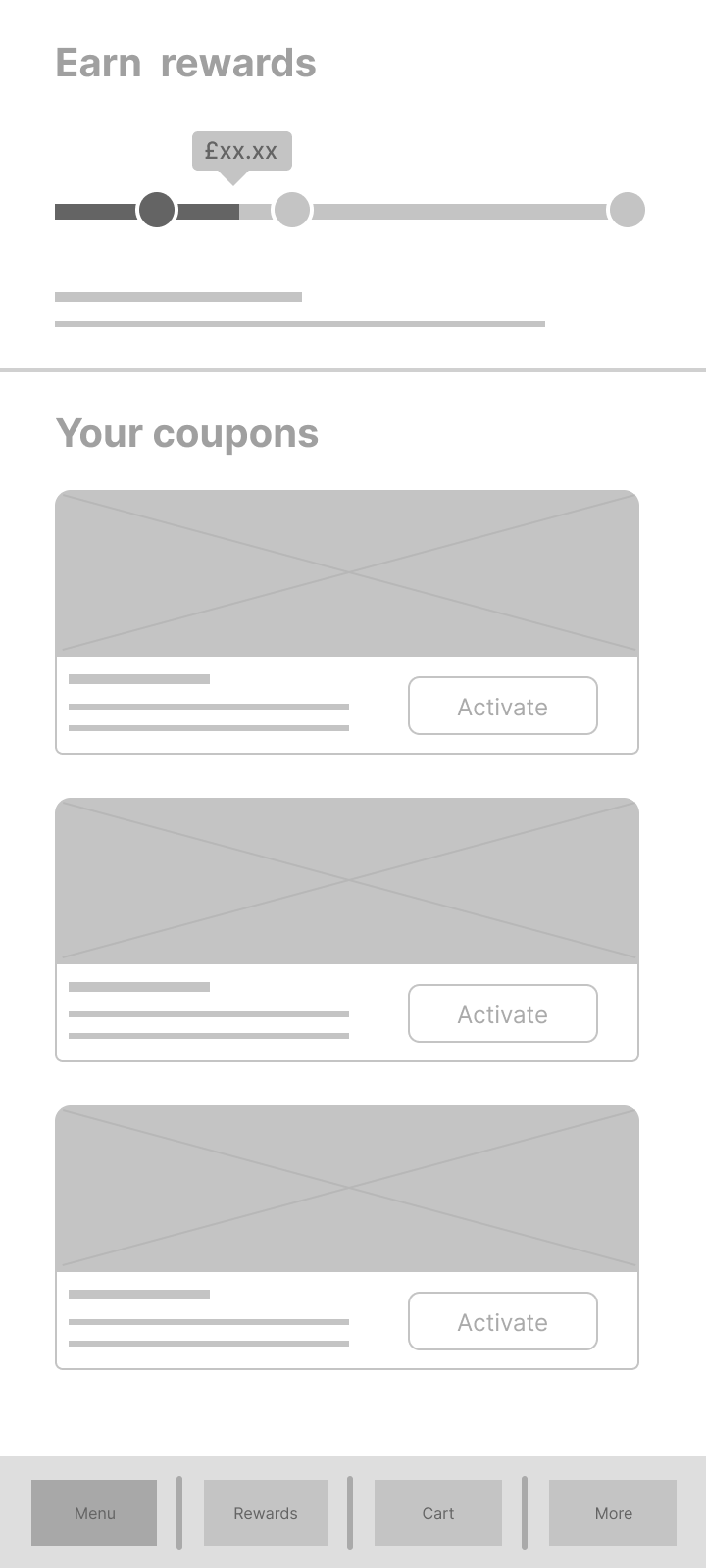
Lo-fi Wireframes
Going from my paper wireframes I was ready to build my lo-fi wireframes in Figma. At this stage as I wanted to focus on the usability of the product and not the design, content or branding. I kept things simple. This means people who got to test the wireframes would not generate biases based on the way the product looks.


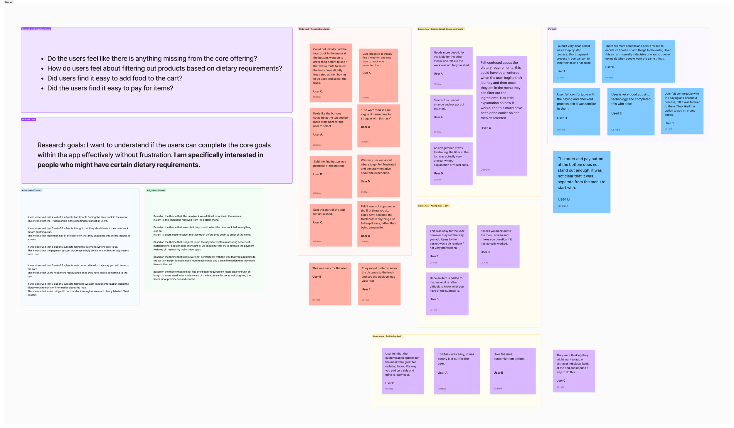
Affinity Diagram
After my initial phase of producing lo-fi wireframes I worked on a usability study and produced an affinity diagram, this helped me identify key themes that needed improving when moving onto the next stage of design.
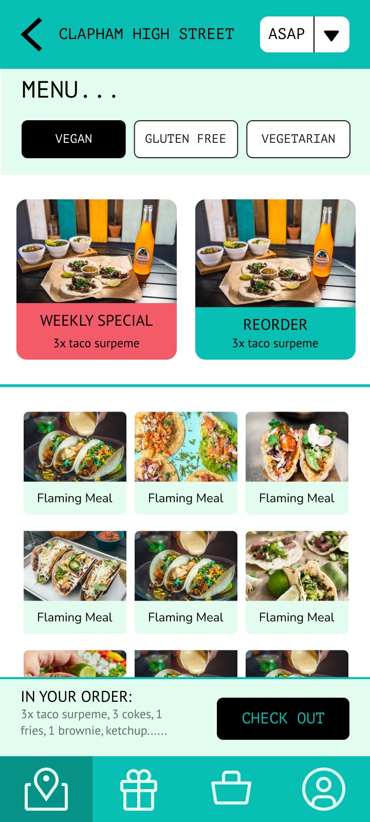
High Fidelity Design
Once I had gone through a phase of usability testing it was time to bring my product to life with the use of colours, images, and content. Using my skills as a digital designer I found this straightforward. One major design consideration for me was choosing a colour scheme that is compliant with WCAG guidelines allowing the text to be easily read by everyone.